Tutorial: Common CryoSPARC Plots

A detailed description of the common plots that CryoSPARC makes across multiple job types.

Particle Picking

NCC vs Power Score

This 2D histogram is presented in Inspect Particle Picks as well as in CryoSPARC Live’s Picking tab. The Normalized Cross Correlation (NCC) is binned along the x-axis, and the local Power Score is binned along the y-axis. The NCC tells us how well how a particle candidate matches the template (used for picking) in terms of its shape; the value is equal to the cross correlation between the template and the patch of the micrograph at each point. It is often helpful to remove picks with low NCC scores. The power score is a measure of pixel intensity at a particular location; the value is equal to the squared amplitude of the signal, after background subtraction. Regions of the micrograph with low power score often correspond to empty patches, or false positive picks. Regions of the micrograph with high power score often correspond to aggregated proteins, nanoparticles, carbon edges, or crystalline ice. Thus, it is often helpful to remove picks with extreme (large or small) power scores relative to the dataset’s distribution.

Example of using power to remove ice and aggregation

This is an example of a micrograph’s picks, before and after removing high-powered picks (in this dataset, power score greater than 887). Note how picks from the ice region near the top left are removed, as well as picks from areas of aggregated proteins near the bottom and right side.

Example of using power to remove low contrast picks

This is an example of a different micrograph’s picks, before and after removing low-powered picks (in this dataset, picks with a power score less than 552 are removed). Note how picks from areas of particularly low contrast, containing many false positive picks, are removed.

Basic 2D plots

Class ESS (Effective Sample Size) Histogram

Probability of Best Class Histogram

This histogram shows the distribution of the maximum probability across classes for each particle. A particle with low probability in its best class has significant probability distributed across other classes (i.e., it has high class ESS), meaning that the particle’s classification is uncertain. When most particles have a probability of best class near 1.0, the particle set is confidently classified and classification has converged.

Class Averages

This figure displays a grid of class averages with overlaid metrics. The metrics are: (1) the number of particles assigned to the class, (2) the FRC (Fourier Ring Correlation) resolution of the class, and (3) the median class ESS of particles assigned to that class. The resolution reported (metric 2) is the value at which the FRC crosses a threshold of 0.5 for each class. Classes with poor resolution contain many junk particles. Classes with high median particle ESS contain many uncertain particles, indicating that the class may be too similar to other classes, or may contain particles that should belong to several different classes.

Basic 3D plots

Real-Space Slices

Three real-space slices of a 3D density. These are produced by many refinement jobs within CryoSPARC. Each subplot shows a real-space density slice along one of the coordinate planes: z-y, z-x, and y-x, respectively. The pixel colour is proportional to the scalar density value at each voxel.

Real-Space Projections

Three real-space projections of a 3D density. These appear primarily in Ab-initio Reconstruction’s structure plots. Instead of slicing the density along a plane, the density is summed (i.e. integrated) along the normal to that plane, and the resulting sum is displayed, for the z-y, z-x, and y-x planes respectively.

Fourier-Space Slices

These three subplots display coordinate-plane slices of the Fourier volume. The Fourier volume is the 3D grid of complex numbers that result from applying a 3D discrete Fourier transform to the real-space density. Colours correspond to log amplitude (also called the ‘magnitude’ or ‘modulus’) of each Fourier coefficient. Note that although each Fourier component is complex-valued, only the amplitude (and not the phase) is displayed in this plot.

Guinier Plot

The Guinier plot displays the following:

  • In green: the logarithm of the ‘structure factor’ F (i.e., the logarithm of the shell-averaged squared norm of the Fourier coefficients)

  • In blue: the straight-line envelope function computed from the ‘B factor’. This envelope function is calculated by fitting a line to the log-structure factor between 10 Angstroms and the 0.143 FSC resolution, and the fitted B-factor is proportional to the slope of this envelope function. Some nuances about how this differs from bfactor estimation in other SPA software can be found on our discussion forum.

as described in section 4.7 of (Glaeser et al., 2021), and (Rosenthal & Henderson, 2003).

Orientation Plots

The next two plots contain information regarding the distribution of orientations in the dataset. For a more thorough discussion of orientation-related diagnostics, including metrics to diagnose preferred orientation, refer to the .

Viewing Direction Distribution

The viewing direction distribution plot is one of two plots illustrating the diversity of orientations in the dataset. Every particle has an associated viewing direction, which is understood as the direction vector of the integral projection that the 2D particle was generated from, relative to the global orientation of the 3D volume. The set of possible viewing direction vectors can be interpreted as the surface of a unit sphere, or a “globe”. Thus in the viewing direction plot, the x-axis corresponds to azimuth (analogous to longitude) and the y-axis corresponds to elevation (analogous to latitude). The viewing direction plot is a 2D-histogram that shows the number of particles with a viewing direction at a particular elevation/azimuth bin. The viewing direction distribution plot is useful for understanding the diversity of orientations present in the dataset. However, it generally cannot be directly used to infer if the dataset has preferred orientation issues, because the viewing direction distribution doesn’t directly visualize the directions along which the volume is well-sampled. The orientation diagnostics job provides a more thorough set of tools for diagnosing orientation issues.

Posterior Precision Directional Distribution

The posterior precision directional distribution plot is another plot illustrating the diversity of orientations in the dataset. If the volume is located at the center of a large circumscribed sphere, the elevation and azimuth angles define the direction of a radial line segment pointing out from the center of the structure. The posterior precision directional distribution plot displays roughly how many images contributed to the voxels that lie along this radial line segment. Note that this is different from the viewing direction distribution, which shows the axis along which the particle was viewed, i.e. the axis along which the volume was projected to generate the particle. The two plots are related as follows: if the viewing direction plot shows non-zero density at a viewing direction of v, then the posterior precision plot will show nonzero density at the set of all vectors orthogonal to v, i.e. the plane with normal vector v. For a greater understanding of the geometric relation between these two plots, it is useful to gain an understanding of the Fourier-slice theorem.

A related plot of the “Fourier Sampling” displayed in the orientation diagnostics job is very similar to the posterior precision directional distribution plot. The difference between the two is that the posterior precision plot accounts for the loss of information induced by the CTF of the particles, whereas the Fourier Sampling plot displays purely geometric information related to the particles’ alignments.

FSC (Fourier Shell Correlation) Plots

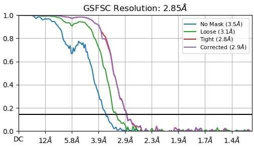
FSC (Fourier Shell Correlation) plots display the correlation coefficient between successive spherical shells in Fourier space, between the two half-maps in a refinement. Each curve in the FSC plot displays the correlation values with different real-space masks applied to the volumes prior to taking their Fourier transform. These masks remove noise from the regions of the box that don’t correspond to protein structure. The spherical mask is a spherical window centered on the box center. The loose and tight masks are generated via thresholding and padding the volume, where the loose mask is given a more generous padding width than the tight mask. The “corrected” curve uses the same mask as the tight mask, but is computed after performing high-resolution noise substitution (Chen et al., 2013). The resolution value in Angstroms at which these curves cross the 0.143 threshold is denoted in parentheses, and is generally accepted as the “resolution” of the structure. Typically, the tight mask or corrected curves are taken as representing the resolution of the structure, but the spherical mask resolution may be more accurate for lower or moderate resolution structures.

High resolution phase randomization

The “corrected” FSC curve is the FSC curve obtained by following a similar procedure to that outlined by Chen et al. in their 2013 publication, High-resolution noise substitution to measure overfitting and validate resolution in 3D structure determination by single particle electron cryomicroscopy. This procedure is applied to any standard refinement algorithm, such as homogeneous refinement in CryoSPARC. As published by Chen at al, it consists of creating a second set of particles that are identical to the original dataset except with random phases beyond a certain resolution in the particle dataset; this dataset is identical to the first at low and medium resolutions, but does not contain phase information of the signal at high resolutions. Then, this dataset is to be separately refined against a reference, simultaneously with the original particle dataset. This procedure was developed as a way to measure systematic contamination (or “overfitted noise”) that has been induced by application of a mask during FSC calculation; the FSC curves from the “phase-randomized” dataset can be compared quantitatively with the FSC curves from the original refinement.

It is important to note that this modified phase-randomization procedure means that the corrected FSC curve does not reliably indicate whether overfit noise has built up during the refinement. The corrected FSC curve can only indicate whether the mask used to compute the FSC (this is the “Tight” mask in any FSC plot) is “too tight” to reliably report resolution. Devising improved resolution metrics is an important problem facing the overall field of cryo-EM, and a foolproof metric of resolution does not currently exist.

In the figure below, three examples of FSC curves along with associated mask tightnesses are shown. The leftmost side shows an example of a corrected FSC curve that indicates a mask with good tightness has been used, with minimal shared overfitting between the half-maps. The middle plot shows an example of the mask being slightly too tight — note how the “corrected” curve drops around 3.8 Å but eventually returns to being coincident with the tight curve. Finally, the rightmost plot shows an example where the tight mask is significantly too tight, made clear by the corrected curve substantially deviating from the uncorrected (tight) curve, and remaining this way indefinitely.

FSC Curves not dropping to zero

Ideally, the FSC curve should drop to 0.0 before the Nyquist limit. When this occurs, the reconstruction resolution is limited by particle image quality and not pixel or image size.

If the FSC remains positive all the way to the Nyquist limit, that means the two half maps are positively correlated at the highest frequency represented in the images. There are two reasons this typically happens: particle images which have been downsampled to too small a box size, and duplicate particles.

It is common practice to significantly downsample particles early in the processing pipeline. This speeds early steps during which reconstructions are not expected to achieve high resolutions. Eventually, the particle stack becomes clean enough that the resulting reconstruction achieves Nyquist at this downsampled box size. In this situation, the FSC stays very high across the entire frequency range available in the images.

In these cases, it is highly likely that re-extracting these particles with a larger box size (i.e., with less downsampling) will improve the resolution of the reconstruction. This is because downsampling the particle images removes high frequency information. However, the high FSC value at Nyquist indicates that this higher-frequency information would likely correlate between the two maps.

On the other hand, FSC curves for maps with duplicate particles remain positive all the way up to Nyquist, but have a long rightward “tail” as shown in the image below. This can occur when particle picks are too close to each other in the dataset, which may happen when combining particle picks from multiple picking strategies. Particles that are too close may become coincident after being aligned to the reference during a refinement, and if these particles are present in two different half-sets, they will break the independence assumption between half-sets and thus invalidate the reconstructions.

The Remove Duplicate Particles job may be used to discard particles that are too close to each other, if particle pick locations are available. Note that Helical Processing tools in CryoSPARC address this problem differently, by explicitly placing particles with overlapping signal into the same half-set, to preserve the independence between half-sets.

Sharp bumps in FSC (CTF issues)

Systematically incorrect CTF parameters can often manifest as oscillations in a refinement’s FSC. These are characterized as multiple oscillations in the FSC that appear like the curves in the image below. If these are observed in final refinements, it is likely that one or more of the microscope optical parameters are incorrectly specified: important parameters to check are the pixel size, accelerating voltage, and spherical aberration. This phenomenon is discussed in more detail in RELION’s documentation.

Dip in FSC due to disordered regions

For membrane proteins with disordered regions (e.g. micelles or nanodiscs), it is common for there to be a region in the frequency band (approximately between ~9 Å and ~5 Å) where the FSC value dips lower than surrounding values. This is due to the stronger presence of disorder in those frequency bands from the lipids forming the micelle or nanodisc, which have no fixed position relative to the protein structure. Generally, this dip is an expected artefact when refining membrane proteins. An example is shown below.

Noise model

The noise model used in a CryoSPARC job is a parameter of the statistical model that governs image formation. Observed images are modelled to be a tomographic projection of the underlying density at some pose, convolved with the point spread function (PSF), and subjected to additive gaussian noise. Physically, this gaussian noise is used to represent the “shot noise” induced during the imaging process in the microscope’s detector. The images, projections, and noise are all represented as two dimensional quantities, and the underlying density is represented as three dimensional.

When the image formation model is expressed in Fourier space, gaussian noise is parameterized as having a diagonal covariance, and subject to the further constraint that all noise variance values are constant across pixels belonging to the same frequency band. This is equivalent to the assumption that noise is isotropic over direction, and therefore all noise models are functions of Fourier shell numbers only. This can be best visualized in the advanced noise model plot below, which shows (on the right) a 2D colour-map of the noise model plot in Fourier space; note the values being constant over a given ring.

In each frequency ring, the noise variance is estimated via computing the Fourier-space “residual” in each image – this is the squared difference between the noisy raw data, and the CTF-corrupted projection of the signal. The squared residual is averaged across all images, and is further averaged across frequency-band, to produce the noise estimate.

A common trend in the noise variance is an increase at high frequencies. An example of this is illustrated in the basic noise model plot, below. This is due to the effect of dose-weighting. While we expect that the noise variance in each individual movie frame is approximately white (that is, approximately constant over different frequencies), the motion-corrected micrograph itself is comprised of a sum of movie frames, and we do not use a uniform weight over frequency or over frame when summing frames to produce a micrograph. This means that the noise variance of the micrograph is not expected to remain white, even if the noise variance of each movie frame is white. In all cases, CryoSPARC uses near uniform weights over frame index when averaging at low-frequencies. At high-frequencies, the weights are large for early frame indices, and small for later frame indices, which has the effect of increasing the noise variance at high-frequencies relative to low-frequencies. More information about dose-weighting schemes can be found in our Reference-based Motion Correction documentation.

References

  • R. M. Glaeser, E. Nogales, and W. Chiu, “4.7 B factors and map sharpening,” in Single-particle cryo-em of biological macromolecules, Bristol, UK: IOP Publishing, 2021, pp. 4-59-4–67

  • P. B. Rosenthal and R. Henderson, “Optimal determination of particle orientation, absolute hand, and contrast loss in single-particle electron cryomicroscopy,” Journal of Molecular Biology, vol. 333, no. 4, pp. 721–745, 2003. doi:10.1016/j.jmb.2003.07.013

  • S. Chen et al., “High-resolution noise substitution to measure overfitting and validate resolution in 3D structure determination by single particle electron cryomicroscopy,” Ultramicroscopy, vol. 135, pp. 24–35, 2013. doi:10.1016/j.ultramic.2013.06.004

Last updated